MWM #11:

And my layout:

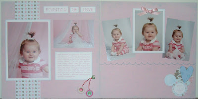
I didn't follow this sketch as closely as I usually do, so that was a big change for me! I have to say that it was COMPLETELY out of my comfort zone to do a layout at an angle, but I'm in love with the way it turned out! This Fancy Pants "My Family" kit has certainly gotten good use while scrapping the pictures I had from this photo session! I even got to use my newest Scrapbooksteals steal...the i-rock! With two girls, I knew I HAD to get one! There's going to be bling on EVERYTHING! :)
MWM #17:

And my layout:

Here are a couple close-ups of details:


While I'm not 100% pleased with the way this turned out, I still think it's pretty cute. You can't really tell from the pictures, but the background cardstock was pink with blue scratch marks all over it. This is why I chose the pink and blue pallate for the layout. The second page seems kind of plain to me, but I still like it.
MWM #18:

And my layout:

I LOVE THIS LAYOUT! I didn't know how to make a layout gender neutral when there was a daddy and a baby girl in the pictures. I took a frilly, dark cardstock and placed it over a plain white cardstock. Adding pinks, blues and greens helped neutralize everything. My husband really likes this layout, so I guess I did something right! :)
MWM #19:

And my layout:

This layout is just so precious! The browns from the papers complement the sepia tone of the picture so well. I also decided to use pinks as they all seemed to go together so well. Of course, I'm addicted to my Basic Grey "Bittersweet" papers and they just *happen* to be in the pink/brown category. :) I used a glittered pink cardstock for the background of this layout. It's just a cute, girly layout and I love it!
MWM #21:

And my layout:

The pictures of my layouts never turn out well, so some of the details get lost in translation. I did this layout on glittered cardstock that seemed to have the same green tones as the layout. This layout has easily made it into my top 10. :)
MWM #22:

And my layout:

This layout CRACKS.ME.UP! When I saw the title in this My Mind's Eye "Merry Days of Christmas" paper pack, I just KNEW I had to use it. What would Christmas pictures with Santa be if there weren't a few hilarious, crying baby pictures? :) Another one of my top 10 layouts!
And last but not least...MWM #25:

And my layout:

Here are some close-ups of details:


Here we go with the Basic Grey "Bittersweet" collection again! :) I just had to use it because it tied together the colors in all of my pictures so nicely! I made the journaling in this layout a letter to my daughter. Hopefully she'll love to see how silly she was when she was little. :)
This is not the end, my friends. :) It's just a goodbye until next time. Hope you've enjoyed looking at my mojo's as much as I enjoyed making them! Until next time!


No comments:
Post a Comment
I love comments! Let me know what you think!