Sunday, August 29, 2010

The big Midweek Mojo reveal!

Calm down, calm down. I know you're excited to see what I came up for this week's Midweek Mojo (from the ladies - namely Kristy - at scrapbooksteals.com). I had fun with this one! First of all, I turned Pandora on and started listening to my "Salt n Pepa" channel. GOOD TIMES! The song I'm listening to as I type this is "Baby got back" by Sir Mixalot. Now if that doesn't take me back to high school, I don't know what will.

ANYWAY, I had some fun papers lying around, so I was excited to use them on this week's challenge. Here is the sketch Kristy created this week...


And here is the layout I came up with...


Isn't it FUN?! The colors of the papers and pictures don't really go together, but I don't even care. I created a layout that I L.O.V.E. and I think it turned out great! I love the My Mind's Eye papers and how all of the cardstock matched it so well. The brads and buttons even coordinated well! I LOVE it when a layout comes together this easily! I wish the picture had turned out a little clearer, but it is breezy outside and every time I tried to take a good shot, the breeze would blow the layout over. In any event, I hope you like the layout as much as I liked making it!

Photobucket

Friday, August 27, 2010

A NEW Challenge!

Now we all know that I've been doing challenges issued by the awesome ladies at scrapbooksteals.com for a while now...but I thought I'd take a leap and try one from one of the other blogs I follow! Yea, me! Kim at Off The Wall Craftiness issues a challenge every week and this week's is one I thought I could pull off. The challenge was to create something using this color scheme:


I had some great My Mind's Eye papers lying around and decided to make the following layout with them:


Didn't it turn out cute?? There isn't a lot of black on the layout, aside from the title alpha stickers, but the other colors are pretty much spot-on! Plus, I REALLY like the pictures of my girls. They crack me up every time I see them! :)

Here's to my first entry at OTWC!

Photobucket

Thursday, August 26, 2010

It's scraplifting time!

I've mentioned it before, it if it weren't for scraplifting, all of my pages would look like a 4 year-old did them. Scraplifting taps into the creativity I didn't know I possessed. I cringe when I think about how boring my first scrapbook looks.

Anyway, I saw this picture in a recent Scrapbooks, etc. add and knew I wanted to do something with it. It's fun, I loved the basic layout concept and I thought the sun was super cute!


Here is my take on it:


The picture didn't come out as clear as I'd hoped because it's slightly overcast today, but I think you get the general idea. I think it turned out really well. It was a little outside my comfort zone to put the journaling on the left side of the picture, but I think it looks good that way. I put the picture on the right-hand side of the page because I thought it would look better if the sun was looking down directly over the pictures of the girls in the water. Speaking of the sun, isn't it cute? :)

I wish I had the creative knack for scrapbooking all on my own, but until that develops in my brain I'm glad I have scraplifting!

Photobucket

Tuesday, August 24, 2010

It's the most wonderful time of the year...almost!

And by the most wonderful time, I don't mean Christmastime (although I do love that time of year as well). I am talking about FALL! After the disgustingly hot summer we've had this year, I am REALLY looking forward to Fall. Luckily, there are tiny hints all over the place that it's just around the corner. The pear tree in our back yard is starting to shed it's leaves (something it does at the end of summer). My oldest daughter found a yellow leaf in our driveway this morning. It's been in the 80s (!!) for two days in a row!! Yes, my friends, Fall is upon us. And not a minute too soon!

Halloween is just 2 short months away and I've already got ideas as to what my girls will dress up as. Sounds like the perfect time to crop LAST YEAR'S Halloween pictures, right? I'm pretty excited about this layout. I had an idea in my head as to what I wanted the layout to look like, then I found a perfect layout to scraplift!

Here is the original (it's small):


And here is my layout:


Here are a couple close-ups of some embellishments and distressing:


I found Coredinations cardstock at my local scrap store that is black with orange underneath and I distressed around the edges with sand paper. I also distressed around the cardstock with ink. I think it turned out pretty cute, if I do say so myself! I'm always shy when it comes to embellishments, but I think the brads and stickers I used fit in really well. Now that I have this page done, I'm looking forward to Halloween this year!

Photobucket

Saturday, August 21, 2010

Midweek Mojo Time!

Anyone who knows me in the crafty world, knows that I am a fan of Scrapbooksteals. Kristy issues a sketch challenge on the blog every Wednesday and this week's Midweek Mojo sketch was a doozy! It was a 2-pager with FIVE pictures AND journaling! Phew! Overall, I'm glad with the way it turned out. These challenges are great because they're allowing me to use some of the 200+ pictures I have sitting on my scrapbooking table just BEGGING to be cropped! The thing I loved most about this challenge is that I could use so many pictures and tell so many stories on one layout. Moving right along...

Here is this week's sketch:


And here is my interpretation:


I used pictures of my oldest daughter doing silly things and I think it turned out great! The thickers I used for the title were white, but I used my chalks to make them fit in more with the colors of the layout.

I'm SO glad Scrapbooksteals is doing these challenges! My pages are all VERY different now and I don't have to think too hard about what I want the layouts to look like...they're all drawn out for me!

Photobucket

Monday, August 16, 2010

My Week in Scrappiness...

We're two days into the week and I'm off to a roaring start! I've made a card and a layout in the past two days and have been challenged doing both!

Our nephew, Jake, turned 2 a couple weeks ago and his bday party was last night. As I mentioned in my last post, I haven't had to make too many "male" birthday cards, so I took it upon myself to challenge, well, myself, to make a kid's card. Not just a kid's card...a BOY'S card! Jake and his brother L.O.V.E. Thomas the train, so I was lucky to find some Thomas paper at Joann's.

This is what I came up with:


Here is a close-up of the sticker I made:


It turned out really cute and I was proud to give it to Jake. It made the rounds through the family that was gathered at the party and it was decided (not by myself) that I need to make cards for a living. :)

This past Wednesday, Scrapbooksteals issued their weekly Mojo challenge. After taking a week off, I decided to give this one a try. Here is the sketch:


And here is my layout:


I used the very last of my My Mind's Eye Bella Bella papers (a previous "steal") and I'm sad. I LOVE the simplicity of this line and it's soft, muted tones were perfect for the layout I created. I also love the flourishes in the corners of the page. The background page was a journaling-type page with lines, but I cut out around the flourishes and entered the patterned paper over the lines. It turned out pretty cute!

Photobucket

Monday, August 9, 2010

Happy Birthday, Brudder!

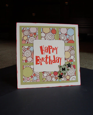
I recently made a birthday card for my brother, who's birthday was on the 7th. It's harder for me to make "boyish" things. Having two girls, I am very good at all things pink and girly, but I never really make things for boys/guys.

This is what I came up with:


Here is a close-up of the buttons and brads I used to dress up the card:


I distressed the edges of the card and the "happy birthday" sign with ink so make them stand out a little more. It's not my best work, but I'm obviously proud enough of it to post it here! :)

Photobucket

Tuesday, August 3, 2010

Finally done! Ugh!

Have you ever done a layout that you were just SO glad to have completed? This layout is like that for me. I've had this idea in my head for over a month to do a layout relaying what a "Toy Story" summer it's been around here, but for some reason I just dreaded actually working on this layout. I cut out each cloud by hand because I couldn't find the perfect paper to mimic Andy's room's wallpaper. I created the title from scratch and cut out the Woody and Buzz by hand as well. A lot of hand-cramping work went into this layout. It turned out very cute, though, I must say. I feel like I need more on the right-hand side of the layout, but this will do for now. Maddie's going to LOVE this one! :)


Photobucket

Sunday, August 1, 2010

Mid-Week Mojo Challenge!

I've been slacking on updating my blog, so forgive me! That being said, I have certainly not been slacking in the scrapbooking department! ESPECIALLY, with scrapbooksteals' Midweek Mojo Challenge every week! Here is the latest layout I completed for the challenge, as well as another layout that I am VERY proud of.

This is the sketch for the challenge issued on 7/28:


And here is my take on it:


Two-page layouts are always a challenge. Especially when elements, such as borders or photo backgrounds, need to match up on both pages. I'm very pleased with the way this layout turned out. I love these challenges because they're allowing me (or forcing me) to use pictures I either took a long time ago or printed out a long time ago. Now that I'm into scrapbooking, I can't understand why anyone would have a strictly "photo" album, or one that holds thousands of pictures and no personality. Granted, I am guilty and have about three albums FULL of baby pictures of my oldest daughter, but I plan on scrapping those pictures in due time!!

Moving right along...last week I found a picture of me with my Grandma which was taken at my wedding 8 years ago. My Grandma passed away a little more than a year ago and I miss her more as time goes on. I felt compelled to make a special layout with this picture:


Here is the layout I created to showcase it:


This has to be the prettiest layout I've ever done. I hand-stitched all of the embellishments in the corner and around the photo mat. I created my first "flowers" and they turned out so beautifully. Not that I needed the extra vote of confidence, but I knew I had done a good job when I showed it to my 3 year old and she gasped and said "Oh Mommy! It's so BEA-U-TIFUL! That's my Granny!" :) Granted, Maddie only met my Grandma once when she was 9 months old, and we never called her "Granny," but I LOVE that Maddie knows who she is.

Until next week!

Photobucket