ME!! After a frazzled Kristy from Scrapbooksteals posted that day's mojo, I sent her a message saying I would love to help her out sometime if she needed me. To my surprise, she said yes on the spot! I was so excited to be able to create the sketch for today's mojo! Lucky #13, no less! The Christmas kit from KI Memories had a lot of fun stuff to work with!
Here is MY (!!) sketch:
And here is the layout I created based on MY sketch:
I must say, creating a sketch and then a layout from that sketch was super hard for me! I need a visual aid (a sketch, a layout, etc) to be able to create my own pages, so starting from scratch was a challenge. Once I figured out what I wanted my sketch to look like, everything else fell into place!
Once I completed my layout, I decided I wasn't done working with the kit. I wanted to make a card with some of the other elements from the kit...the "placemat-like" sheet mostly. I used it for the background of a card, then used my i-top and another sheet from the kit to create berrys for the holly. Still being a novice with the i-top, I think the berries could have turned out better, but I think it was a valiant attempt. :)
I'm so excited to see how other ladies interpret my sketch this week!
Wednesday, October 13, 2010
Tuesday, October 12, 2010
Back in the saddle again...
Hello all,
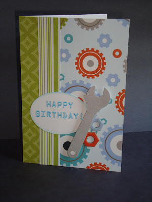
It's been a while since I've blogged, but fear not. I've been crafty since the last time I wrote. I made a card for my husband's birthday that was borderline manish...
I used My Mind's Eye's 'Lil Robots collection. It had various bolts and tools, so I figured it would make a good birthday card for a man. He liked it. :)
Also, I completed a mojo page a couple weeks ago. Here is the sketch:
And here is my take on it:
I love how the papers (all MME!) are not Easter-themed, but the soft pastels work for the theme. Plus, I love how I was able to crop a bunch of pictures in one layout. That's always helpful when I have a lot of pictures to choose from for one event.
That's all for now...exciting news coming tomorrow morning!
Monday, September 27, 2010
A few new Mojo's...
The ladies at Scrapbook steals decided to award a prize to someone in the "Diamond Club" (people who have completed all 10 Midweek Mojo's - MWM - thus far). They also gave everyone until midnight tonight to "catch up" if they hadn't completed every MWM. I hadn't done three of them, so yesterday and today I completed them. Here we go:
MWM #3...here's the sketch:
And here is my layout:
As I was uploading this layout to the Scrapbooksteals facebook fan page, I realized I forgot to add the title. It's tentatively titled "Fun with Corn." I am not really pleased with the way my printer printed out these pictures, but I think the layout as a whole turned out pretty well. I used my new i-top brad maker (which was a lot harder than I was expecting) to make the brads on the bottom left. All in all, it is a memory I wanted to remember and this layout will have to do. :)
MWM #9...here's the layout:
And here is my take on it:
I wasn't too keen on the paper choices at first, but now that it's all layed out, I think they go pretty well. They coordinate with the paper I used to make the arrow. I used chalk ink to distress around the edges of the paper. My favorite things about this layout are the cards I used for the journaling. They are from Bo Bunny's new "Learning Curve" line and worked perfectly for this layout! I have a feeling my daughter's going to like this layout. :)
MWM #10...Here's the sketch:
And here is my take:
I love how this layout turned out. I was trying to think of a way to crop many of the photos that I took at Easter this year, and this sketch worked perfectly for that! The MME papers I used worked well with the Easter theme. And while my plan of journaling over an "egg" failed, I still think this layout turned out better than I could have hoped!
Well, that does it! I'm in the Diamond Club now! Keep your fingers crossed for me as I'm hoping to win the fabulous prize of a beautiful collection from MME's Lost and Found line!!
Monday, September 13, 2010
Midweek Mojo and a Mouse...
Yesterday (Sunday) I woke up with THE WORST pain in my neck/back. It feels like a pinched nerve under my left shoulderblade, but the pain stretches across my upper back and up my neck. So basically, I feel awesome. The pain hasn't gone down much today, either. I can barely look up and can't look down, left or right. Why am I telling you this? Because miraculously I was able to complete a layout earlier this afternoon! Since I can't look down, I got down on my knees. Luckily, this week's sketch from Scrapbooksteals was easy and I had the layout done in my head, so I was able to knock it out in less than an hour!
This week's sketch was created by Lisa Mack. Here's the sketch:
And here is my interpretation of it:
Didn't it turn out cute? I used paper from Basic Grey's Bittersweet collection, which I L.O.V.E! I had fun making a layout for the pictures I chose. My friend got married in May and my oldest was infatuated with her the whole night! Maddie thought she looked like a fairy princess and thought everything she did was magical. Luckily, I have an awesome friend and she humored Maddie the entire night.
You can't really see them, but I put random pink "shiney stones" (as Maddie would call them) on the bottom right of the layout (among the brads). It turned out pretty cute!
Last week I completed a layout from when my husband and I took Maddie to see Disney on Ice. Maddie LOVES Tinkerbell, whom this show featured, so we knew she'd love it. As a bonus, she got to see Mickey, Minnie, Donald, Goofy, Ariel (the little mermaid), the Lion King, and cars from Cars, too! We had a great time and Maddie was passed out in the car before we even got out of the parking garage! Here's the layout:
This layout is a little plain, but I love the glittery title I found at my local scrapbooking store. I think the layout turned out cute...and Maddie think's it's pretty awesome as well. :)
Wednesday, September 1, 2010
I'm in the mood for Fall...
I've mentioned before that I LOVE fall. The colors, the smells, the cooler air, the comfy clothes...aahhh. It's right around the corner. Maybe that is why I chose to crop some pictures from last fall. My mom took pictures of us in a great location in her neighborhood and the pictures turned out amazing! I cropped three of the four great pictures from that day for this layout. The fourth picture was used in this layout.
I may or may not be using this picture for this week's weekly mojo. I didn't do it specifically with the mojo sketch in mind, but it ended up being somewhat similar to the sketch. I'll revise this and add the sketch if I end up using this layout for it.
Anyway, here is the layout:
And here is a close-up of some of the detail work:
I think this page turned out really cute! I used some new paper from a stack by DCWV called "The Green Stack." The papers in that stack are SO CUTE! I also got a stack by DCWV called "The Linen Closet - cardstock." That is where I got the sparkly cardstock that I used behind the title (see small picture). I am in love with sea foam greens, browns, creams, reds and light blues right now and these two stacks have it all!
Sunday, August 29, 2010
The big Midweek Mojo reveal!
Calm down, calm down. I know you're excited to see what I came up for this week's Midweek Mojo (from the ladies - namely Kristy - at scrapbooksteals.com). I had fun with this one! First of all, I turned Pandora on and started listening to my "Salt n Pepa" channel. GOOD TIMES! The song I'm listening to as I type this is "Baby got back" by Sir Mixalot. Now if that doesn't take me back to high school, I don't know what will.
ANYWAY, I had some fun papers lying around, so I was excited to use them on this week's challenge. Here is the sketch Kristy created this week...
And here is the layout I came up with...
Isn't it FUN?! The colors of the papers and pictures don't really go together, but I don't even care. I created a layout that I L.O.V.E. and I think it turned out great! I love the My Mind's Eye papers and how all of the cardstock matched it so well. The brads and buttons even coordinated well! I LOVE it when a layout comes together this easily! I wish the picture had turned out a little clearer, but it is breezy outside and every time I tried to take a good shot, the breeze would blow the layout over. In any event, I hope you like the layout as much as I liked making it!
Friday, August 27, 2010
A NEW Challenge!
Now we all know that I've been doing challenges issued by the awesome ladies at scrapbooksteals.com for a while now...but I thought I'd take a leap and try one from one of the other blogs I follow! Yea, me! Kim at Off The Wall Craftiness issues a challenge every week and this week's is one I thought I could pull off. The challenge was to create something using this color scheme:
I had some great My Mind's Eye papers lying around and decided to make the following layout with them:
Didn't it turn out cute?? There isn't a lot of black on the layout, aside from the title alpha stickers, but the other colors are pretty much spot-on! Plus, I REALLY like the pictures of my girls. They crack me up every time I see them! :)
Here's to my first entry at OTWC!
What I've used:
challenges,
thickers
Thursday, August 26, 2010
It's scraplifting time!
I've mentioned it before, it if it weren't for scraplifting, all of my pages would look like a 4 year-old did them. Scraplifting taps into the creativity I didn't know I possessed. I cringe when I think about how boring my first scrapbook looks.
Anyway, I saw this picture in a recent Scrapbooks, etc. add and knew I wanted to do something with it. It's fun, I loved the basic layout concept and I thought the sun was super cute!
Here is my take on it:
The picture didn't come out as clear as I'd hoped because it's slightly overcast today, but I think you get the general idea. I think it turned out really well. It was a little outside my comfort zone to put the journaling on the left side of the picture, but I think it looks good that way. I put the picture on the right-hand side of the page because I thought it would look better if the sun was looking down directly over the pictures of the girls in the water. Speaking of the sun, isn't it cute? :)
I wish I had the creative knack for scrapbooking all on my own, but until that develops in my brain I'm glad I have scraplifting!
What I've used:
buttons,
chalks,
scraplifting,
sewing
Tuesday, August 24, 2010
It's the most wonderful time of the year...almost!
And by the most wonderful time, I don't mean Christmastime (although I do love that time of year as well). I am talking about FALL! After the disgustingly hot summer we've had this year, I am REALLY looking forward to Fall. Luckily, there are tiny hints all over the place that it's just around the corner. The pear tree in our back yard is starting to shed it's leaves (something it does at the end of summer). My oldest daughter found a yellow leaf in our driveway this morning. It's been in the 80s (!!) for two days in a row!! Yes, my friends, Fall is upon us. And not a minute too soon!
Halloween is just 2 short months away and I've already got ideas as to what my girls will dress up as. Sounds like the perfect time to crop LAST YEAR'S Halloween pictures, right? I'm pretty excited about this layout. I had an idea in my head as to what I wanted the layout to look like, then I found a perfect layout to scraplift!
Here is the original (it's small):
And here is my layout:
Here are a couple close-ups of some embellishments and distressing:
I found Coredinations cardstock at my local scrap store that is black with orange underneath and I distressed around the edges with sand paper. I also distressed around the cardstock with ink. I think it turned out pretty cute, if I do say so myself! I'm always shy when it comes to embellishments, but I think the brads and stickers I used fit in really well. Now that I have this page done, I'm looking forward to Halloween this year!
What I've used:
brads,
distressing,
pop outs,
ribbon,
scraplifting,
stickers
Saturday, August 21, 2010
Midweek Mojo Time!
Anyone who knows me in the crafty world, knows that I am a fan of Scrapbooksteals. Kristy issues a sketch challenge on the blog every Wednesday and this week's Midweek Mojo sketch was a doozy! It was a 2-pager with FIVE pictures AND journaling! Phew! Overall, I'm glad with the way it turned out. These challenges are great because they're allowing me to use some of the 200+ pictures I have sitting on my scrapbooking table just BEGGING to be cropped! The thing I loved most about this challenge is that I could use so many pictures and tell so many stories on one layout. Moving right along...
Here is this week's sketch:
And here is my interpretation:
I used pictures of my oldest daughter doing silly things and I think it turned out great! The thickers I used for the title were white, but I used my chalks to make them fit in more with the colors of the layout.
I'm SO glad Scrapbooksteals is doing these challenges! My pages are all VERY different now and I don't have to think too hard about what I want the layouts to look like...they're all drawn out for me!
Monday, August 16, 2010
My Week in Scrappiness...
We're two days into the week and I'm off to a roaring start! I've made a card and a layout in the past two days and have been challenged doing both!
Our nephew, Jake, turned 2 a couple weeks ago and his bday party was last night. As I mentioned in my last post, I haven't had to make too many "male" birthday cards, so I took it upon myself to challenge, well, myself, to make a kid's card. Not just a kid's card...a BOY'S card! Jake and his brother L.O.V.E. Thomas the train, so I was lucky to find some Thomas paper at Joann's.
This is what I came up with:
Here is a close-up of the sticker I made:
It turned out really cute and I was proud to give it to Jake. It made the rounds through the family that was gathered at the party and it was decided (not by myself) that I need to make cards for a living. :)
This past Wednesday, Scrapbooksteals issued their weekly Mojo challenge. After taking a week off, I decided to give this one a try. Here is the sketch:
And here is my layout:
I used the very last of my My Mind's Eye Bella Bella papers (a previous "steal") and I'm sad. I LOVE the simplicity of this line and it's soft, muted tones were perfect for the layout I created. I also love the flourishes in the corners of the page. The background page was a journaling-type page with lines, but I cut out around the flourishes and entered the patterned paper over the lines. It turned out pretty cute!
Our nephew, Jake, turned 2 a couple weeks ago and his bday party was last night. As I mentioned in my last post, I haven't had to make too many "male" birthday cards, so I took it upon myself to challenge, well, myself, to make a kid's card. Not just a kid's card...a BOY'S card! Jake and his brother L.O.V.E. Thomas the train, so I was lucky to find some Thomas paper at Joann's.
This is what I came up with:
Here is a close-up of the sticker I made:
It turned out really cute and I was proud to give it to Jake. It made the rounds through the family that was gathered at the party and it was decided (not by myself) that I need to make cards for a living. :)
This past Wednesday, Scrapbooksteals issued their weekly Mojo challenge. After taking a week off, I decided to give this one a try. Here is the sketch:
And here is my layout:
I used the very last of my My Mind's Eye Bella Bella papers (a previous "steal") and I'm sad. I LOVE the simplicity of this line and it's soft, muted tones were perfect for the layout I created. I also love the flourishes in the corners of the page. The background page was a journaling-type page with lines, but I cut out around the flourishes and entered the patterned paper over the lines. It turned out pretty cute!
Subscribe to:
Posts (Atom)